Chapter 4
Gaps mismeasured, misattributed and misunderstood
Table of Contents
Chapter 4 Overview
This chapter probes the challenges of measuring gaps in achievement and gaps in opportunities to learn. It begins with a review of our tendency to think too simplistically about cause-and-effect. The reasoning that people bring to the evidence of differences is often the cause of misinterpretation of gap measures. This quest begins with clarifying one’s questions. Scenarios of real-world gap questions include analysis of suspension rates, gaps in test scores, gaps in opportunities to learn, and bias detection of teacher assigned grades. Models of high-quality gap analysis from the Stanford Educational Opportunity Project show the power of showing results in context, of emphasizing the rate at which students learn, rather than their test scores.
Chapter 4 Excerpt
This chapter is about the measurement of differences and the ways that people understand and communicate those measurements. This admittedly modest aspect of the larger topic has received less attention than it deserves. Oddly, everyone says they’re concerned about these gaps, but almost no one outside of the social sciences uses numbers to describe them. Consider that to be a warning sign.
When you’re working to turn data into evidence to support an argument, consider yourself to be both an architect and a builder. In the construction field, they have a term for this: design-build. You are both designing how to assemble data, and you are building it into a work of well-structured evidence that will stand up to criticism and persuade people. Three factors make gap analysis a hazard zone. First, many people build their evidence with poor quality elements. The data they use don’t mean what they think it means. They disregard imprecision and confuse noise with the signal they’re seeking. Second, they don’t allow for the possibility that someone who views their evidence from another vantage point might reach an entirely different conclusion. As builders, they’ve only viewed their creation from their own vantage point. Strong evidence gets that way after being viewed and critiqued from many angles. Third, the logic that links one observation to another may be flawed. Causality may be presumed, where only correlations exist. Bricks of data may have been connected by a faulty batch of mortar. Or those bricks may have been arrayed improperly. This is a hard-hat job.
For those who are viewers of gap analysis, it is also a risky proposition. You should regard evidence about gaps with care. Get some distance, bring your binoculars and examine the evidence from afar. Look at it from several angles. Then step closer and look for signs of skilled craftmanship. Just as a well-built house reveals the skill of the builder and architect, a poorly built structure will reveal its flaws if you look at it closely—corners that aren’t true 90 degrees and doors that don’t fit squarely in their frames.
In the examples that follow, we’ll show you evidence that’s flawed, and evidence that’s well built. We’ll share with you questions of varying quality, as well as evidence that at times doesn’t really address the question at hand. Put on your skeptic’s thinking cap. Toughen up your emotional armor. This is a conversation where moral and ethical issues—questions of fairness and equity—are front and center. Social justice questions and gap analyses are often intertwined. This makes a reasoned, logical approach to the measurement of gaps more important, even if it’s more difficult….
Chapter 4 Resources
Epstein, David and ProPublica, “When Evidence Says No, But Doctor Says Yes,” Atlantic Magazine, February 22, 2017.
Hattie, John, Visible Learning: A Synthesis of Over 800 Meta-analyses Relating to Achievement, Routledge (2009), Initial National Priorities for Comparative Effectiveness Research. Washington, D.C.: National Academies Press. 2009-10-14. doi:10.17226/12648. ISBN 9780309138369.
Pearl, Judea and Dana MacKenzie, The Book of Why: The New Science of Cause and Effect, Basic Books (2018), 418 pgs.
Pogrow, Stanley, “How Effect Size (Practical Significance) Misleads Clinical Practice: The Case for Switching to Practical Benefit to Assess Applied Research Findings,” The American Statistician, March 2019, pages 223-234, DOI: 10.1080/00031305.2018.1549101
Pogrow, Stanley, Authentic Quantitative Analysis for Education Leadership Decision-Making and EdD Dissertations: A Practical, Intuitive and Intelligible Approach (second edition), International Council of Professors of Educational Leadership (2017), 323 pages.
Rich, Motoko, Amanda Cox and Matthew Bloch, “Money, Race and Success: How Your School District Compares,” New York Times (April 29, 2016).
The Chicago Guide to Writing about Numbers, Second Edition, University of Chicago Press, April 2015, 360 pgs.
Wasserstein, Ronald L., Allen L. Schirm & Nicole A. Lazar (2019) “Moving to a World Beyond ‘p <0.05’,” The American Statistician, (March 2019), pages 1-19, DOI: 10.1080/00031305.2019.1583913

“Educators and parents are awash in data, but how can they correctly use it? This thoughtful book points out some of the many ways in which educational data are misused and offers concrete guidance to do better. Any program preparing teachers or school leaders who will be working with assessment or other educational data could benefit from reading this candid, approachable book.”
Morgan Polikoff – Associate Professor of Education, USC Rossier School of Education
Chapter 4 Data Visualizations
Figure 4.2 - Suspension Rates of Students by Ethnicity for 16 Districts, 2019
The suspension event rate (rate-per-100 students) for students of four ethnic groups. It enables a school or district to see how their suspension rates compare to those in similar schools or districts. In addition, it reveals the disparity in suspension rates for students of those ethnicities.
Figure 4.3 - Suspension Rates of Students by Ethnicity for 16 Districts, 2019
Newark’s suspension rate for Latino/Hispanic students is half that of Morgan Hill’s. Just mouse-over Newark’s name which you’ll find about halfway down the left-hand panel of this leaderboard. The rank order position of Newark will become highlighted in each of the four panels. You may also mouse over the bars in any leaderboard to see which district it belongs to. It is often valuable to note the standing of a district across all four ethnic group suspension rates at the same time.
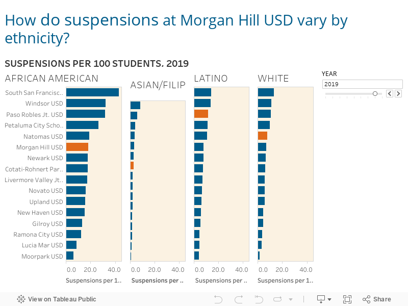
Figure 4.6 - Average Test Scores vs. Socioeconomic Status in Bloomfield School District (IN) and Warren Consolidated Schools (MI)
The average test scores from 2009-2018 for students in Warren Consolidated Schools were well below the scores of students in Bloomfield School District. Note that the two districts had equivalent family socioeconomic status just slightly higher than the national average, which is why both districts appear slightly to the right of the vertical line that defines the national average. The socioeconomic status of the district’s community is on the horizontal axis, and average test scores are on the vertical axis.
Figure 4.7 - Gap in Average Test Scores Between White and Hispanic Students in Bloomfield School District (IN) and Warren Consolidated Schools (MI)
While students’ scores in the two districts are far apart, within both districts there is a negligible gap in scores between white and Hispanic students. That’s why both districts appear on the diagonal line, which is the line defining “zero gap.” That’s why both districts appear on the diagonal line. White students’ scores are on the horizontal axis, and those of Hispanic students appear on the vertical axis. Click this link to dive into the visualization you see below.
Figure 4.8 - Gap in Average Test Scores vs. School Poverty Between White and Hispanic Students in Bloomfield School District (IN) and Warren Consolidated Schools (MI
This view plots gaps of two types against each other. The vertical axis displays the gap in average test scores between Hispanic and white students. The horizontal axis displays the gap in the free-and-reduced-price meals rate between Hispanic and white students. Take note that this is an economic measure different from the community socioeconomic measure. Both districts fall right at the intersection of the two “zero gap” lines. To put this into words, it means that for these two districts, both gap measures are close to zero.
Figure 4.9 - Average Students' Test Scores vs. Socioeconomic Status in Aldine (TX) and Rosemount-Apple Valley-Eagan (MN)
The average test scores from 2009-2018 for students of Aldine ISD were well below that of the scores for students in the Rosemount-Apple Valley-Eagan District. But also note that the two districts served families that were vastly different in education and income. If you ask, “How have Alidine ISD’s students over those ten years scored relative to other districts with a similar socioeconomic profile, you can draw a very narrow rectangle around Aldine ISD’s dot. Notice it sits higher than most other districts captured in that narrow rectangle. That’s good news.
Figure 4.10 - Gap in Average Test Scores Between White and Hispanic Students in Aldine (TX) and Rosemount-Apple Valley-Eagan (MN)
The test scores of white and Hispanic students in Aldine ISD are a small distance apart (.41 grade levels). That explains their proximity to that diagonal “zero gap” line. But the gap separating white and Hispanic students in Rosemount-Apple Valley-Eagan is quite large (2.63 grade levels), which is why they are so far from the diagonal “zero gap” line. Note that to the left of that diagonal “zero gap” line you’ll discover districts where Hispanic students’ test scores were higher, on average over those ten years, than the test scores of white students.
Figure 4.11 -- Gap in Average Test Scores vs. Gap in School Poverty Between White and Hispanic Students in Aldine (TX) and Rosemount-Apple Valley-Eagan (MN)
This view plots the white–Hispanic test score gap against the white– Hispanic meal subsidy gap. The purpose is to see the degree to which those two measures of difference are similar in size. For these two districts, the meal subsidy gap between white and Hispanic students is small and nearly identical (4–5 percent), reading the distance on the horizontal axis. Yet the white–Hispanic test score gap within these two districts is vastly different, with the gap in Aldine ISD about one-sixth the size of the gap in Rosemount-Apple Valley-Eagan.
Figure 4.12 – Average Students’ Test Scores vs. Socioeconomic Status in Charlottesville City Public School District (VA) and Chico Unified School District (CA)Rosemount-Apple Valley-Eagan (MN)
The average test scores from 2009 to 2018 for students of Chico USD were the equivalent of about one grade level below that of the scores for students in the Charlottesville Public Schools. Note that the two districts served families that were quite similar in their socioeconomic attributes. That’s why they appear so close on the vertical axis, almost sitting right on the vertical line marking the national average. Note that both districts sit in large university suburban towns.
Figure 4.13 -- Average Students’ Learning Rates vs. Socioeconomic Status in Charlottesville City Public School District (VA) and Chico Unified School District (CA)
The learning rates of students in these two districts reveal that Chico USD students learned at a rate about 24 percent higher than the national average, while students in Charlottesville Public Schools learned at a rate about 20 percent below the national average. Worth noting is that Chico USD students’ test scores over this ten-year period were quite a bit lower.
The power of learning rates is that they measure what schools and districts add to the knowledge students bring to school. Test scores, on the other hand, reveal a mix of what students bring to school, and what they learn in school. Which would you rather rely upon as a key indicator of your school’s or district’s vitality?
Figure 4.14 -- Gap in Average Test Scores Between White and Hispanic Students in Charlottesville City Public School District (VA) and Chico Unified School District (CA)
The white–Hispanic test score gaps in both districts are large. In Charlottesville, white students’ scores were the equivalent of 2.35 grade levels ahead of the national average. But their Hispanic students’ scores were 0.28 grade levels below the national average. Chico USD’s pattern was different. White students’ scores were right at the national average, and Hispanic students’ scores 1.76 grade levels below.
Figure 4.15 -- Gap in Learning Rates Between White and Hispanic Students in Charlottesville City Public School District (VA) and Chico Unified School District (CA)
White and Hispanic students are learning at about the same rate in Chico USD. The same is true in Charlottesville. Note that both districts sit on that diagonal line that indicates a “zero gap” condition. What differs are the actual rates at which students learn in the two districts. In Chico USD, both white and Hispanic students are learning at a rate about 20 percent higher than the national average. In Charlottesville City Public School District, both white and Hispanic students are learning at a rate about 14–15 percent lower than the national average.