How to Avoid Misunderstanding, Misinterpreting and Distorting Data
Visual glossary
Charts to expand your measurement vocabulary
This may help expand your vocabulary (and your thinking) about measuring schools’ and students’ vital signs. Here you’ll find a brief guide to data visualizations that will take you beyond the limited world of bar charts and pie graphs.
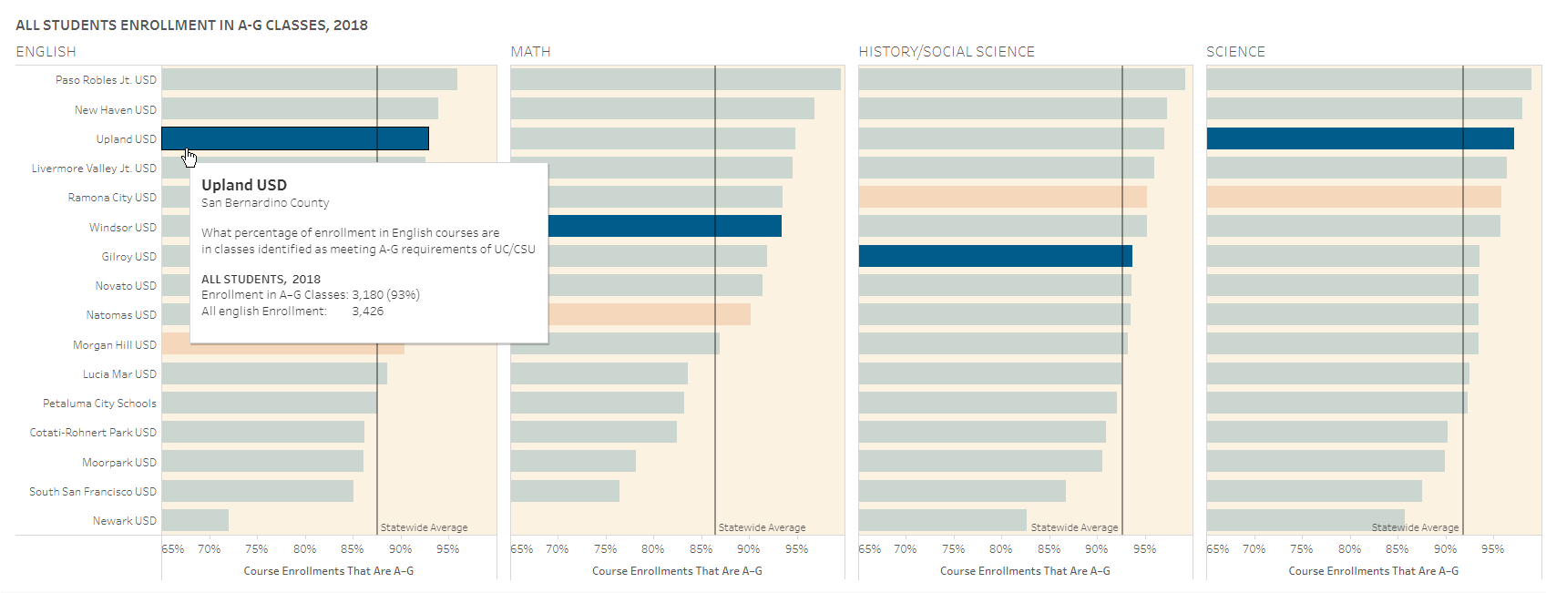
Leaderboards
Leaderboards show the rank order and degree of difference of a lot of entities. Unlike a bar chart or histogram, they enable you to emphasize relative position. This leaderboard shows the relative position of one district against 15 similar districts in their high school students’ enrollment in college-prep classes in each of four core subjects.
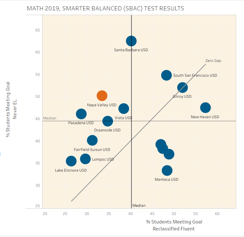
Scatterplots are useful for showing the relation of one factor to another, often for the purpose of exploring correlations. Scatterplots are an excellent way to see two values at once. In this case, you can see the math results of English-learner students who have been reclassified as fluent, juxtaposed against their English-only peers.
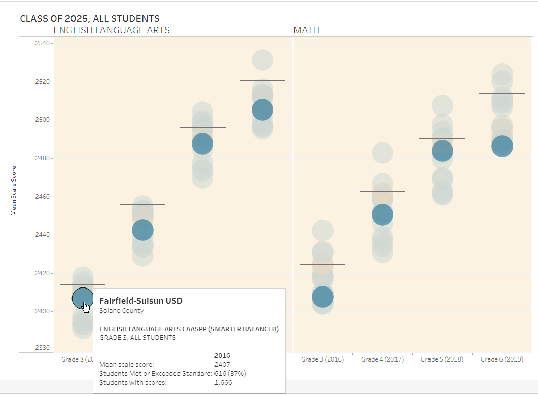
Bubble charts show the relative position or spread of values, of many entities. They are most useful in interactive form, like leaderboards, so you can mouse over the bubbles and learn about an entity’s relative position on an adjacent row or panel. This shows scale score results of 16 districts for a pretty stable group, the graduating class of 2025.
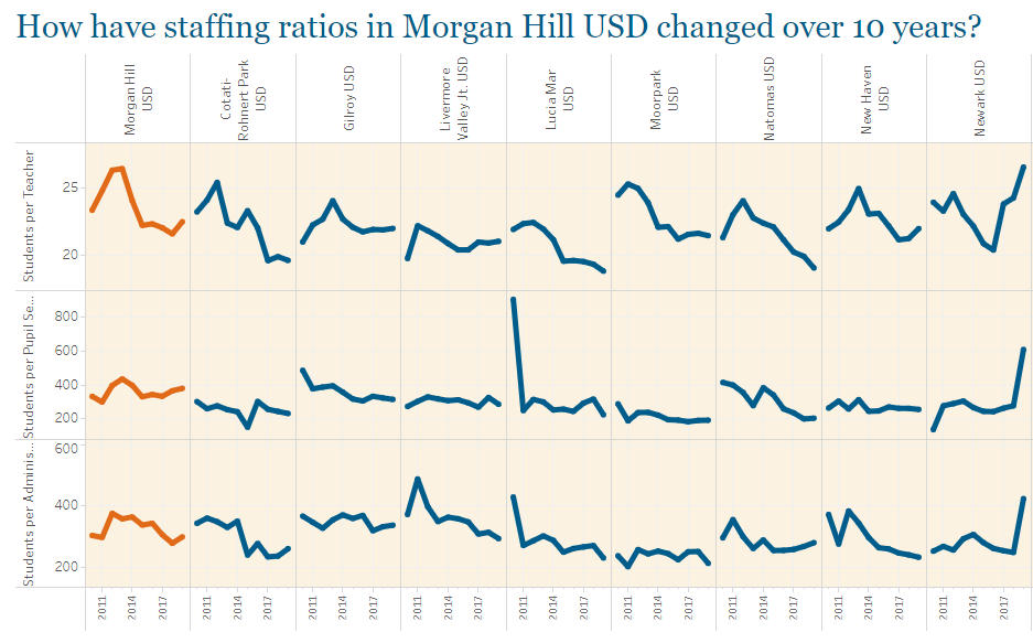
Multi-panel trend lines are used to show variation in rates of change over time for many entities. By looking at the slopes of trend lines, and their peaks and valleys, you can compare how volatile the rates of change have been in districts or schools. This shows the student-staff ratios over ten years time for nine districts.
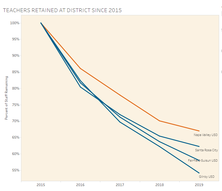
Common-base trend lines are useful for comparing the rates of change for a limited number of entities, from a common base point in time. This visualization shows the retention rate of teachers within their districts, from 2015 to 2019. The district in orange, Napa Valley USD, had the best retention rate of the group
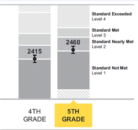
Stem-and-whisker plots are designed to show the top and bottom range of a distribution of values, together with the median or average value. They’re essential for showing the degree of imprecision in any measurement. This example from the Smarter Balanced manual shows that a student’s reported score is really an estimation of her “true” score, which could easily fall a bit above or below that reported score.
Frequency distributions
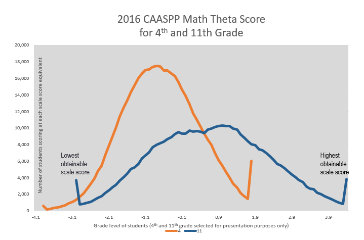
Frequency distributions are a great way to see the number or proportion of students whose test scores fell somewhere on the curve of total results. But more importantly, this view also reveals how widely spread the results are (from lowest to highest scoring) and the extent to which students at both ends of the curve had scores that were literally off the charts.